Originally published on the satire science journal website DNAtured
Think your regular data isn’t scary enough for Halloween? Try these tips to put the “ahhhh!” in your analysis!
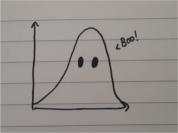
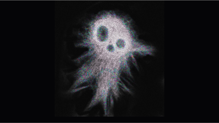
1. Ghostian Curves
Casper is no longer the cutest ghost in town! Draw eyes on a Gaussian distribution curve to make yourself a spooky lil’ ghost.
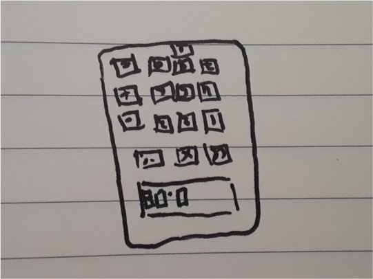
2. Haunted P-Values
You think a p-value of 0.08 is scarily insignificant? Turn your calculator upside down for another scare: BOO
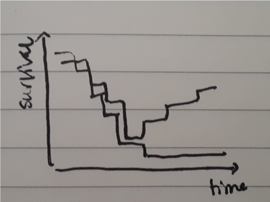
3. Zombie Survival Curves
Night of the living dead? Night of the living rats! Turn those survival curves upside down – or back up – by summoning your test subjects black to life with some Michael Jackson in the background!
4. Witching Hour Gel Electrophoresis
Want some Wicked-ly good pictures? Add a splash of green fluorescent protein to make your image light up like slimy goo!
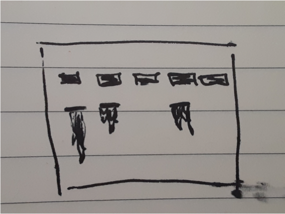
5. Bloody Western Blots
Messed up your assay and now you have a smeared Western blot? No problem! It looks just like smeared blood! The horror!
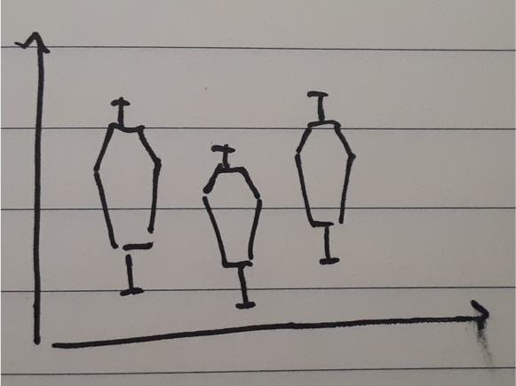
6. Coffin Plots
Don’t ever let anyone say your box plots are boring… Get your spook on and turn them into coffins!
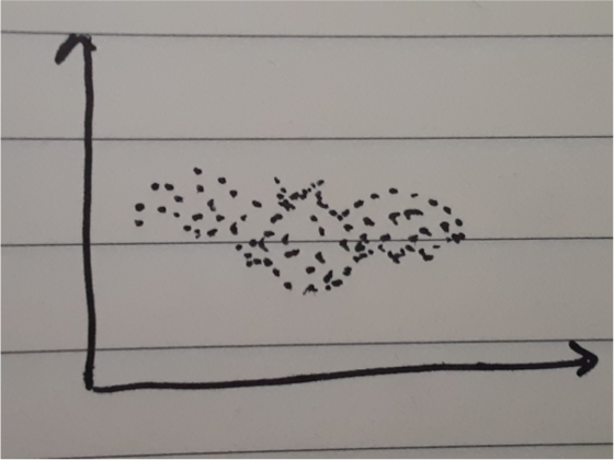
7. Scary scatter plots
Need more spooky plots? Turn your scatter plots into any scary shape: a witch’s hat, a jack o’ lantern, a spider web, or a bat! All you need to do is get rid of those terrifying outliers!
8. Beastly n-Values
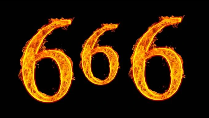
666 summons the devil, so if you have three experimental conditions, make sure your sample number is n=6 for each!
9. Black & Orange Graphs
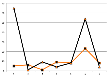
As a last resort, colour code your excel sheet with some spooky colors, we recommend methyl orange. As if using excel for data handling isn’t scary enough, you monster!
10. Dangerous Data Storage Systems
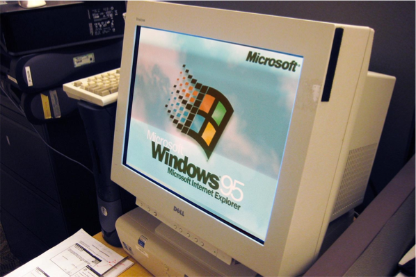
And if nothing else works, live on the edge with the scariest lab data of all: stored on an old, barely functional computer that runs on Windows 94 and hasn’t been backed up in decades!
